This post may contain affiliate links: read full affiliate disclosure.
DIY textured wall art looks simple until you start wondering which material will actually hold those raised patterns without cracking or turning messy.
Even choosing between joint compound, plaster, and modeling paste can make a beginner hesitate before touching the canvas.
Learning how much texture to apply, which everyday tools create clean patterns, and when to stop working the surface makes the process much easier.
In this article, you’ll find DIY textured wall art ideas you can recreate, with practical inspiration for creating depth and shaping different textures.
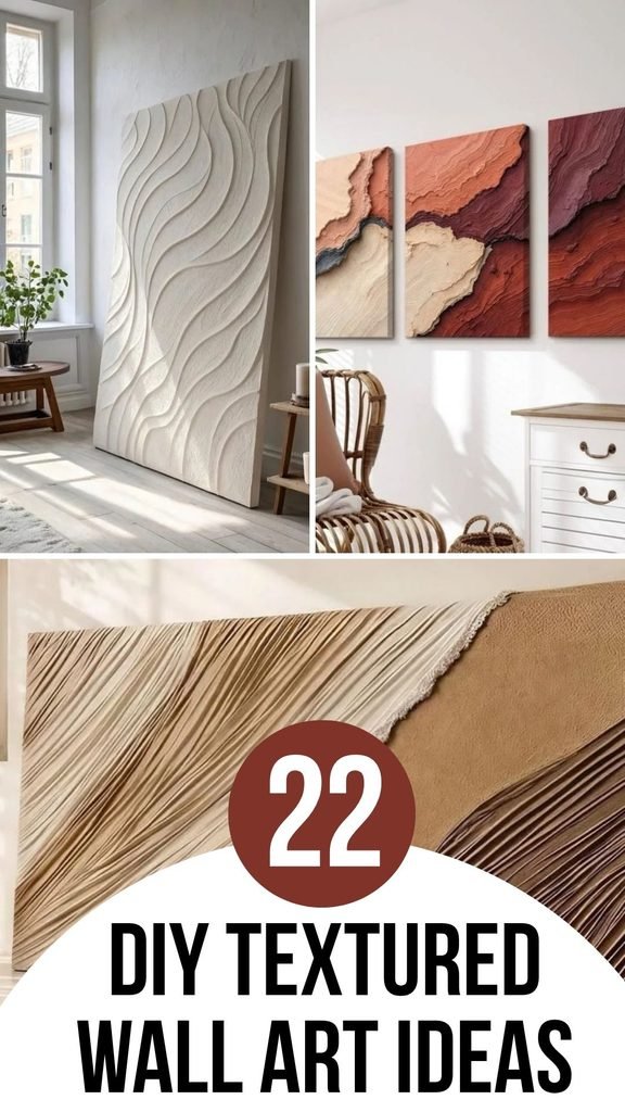
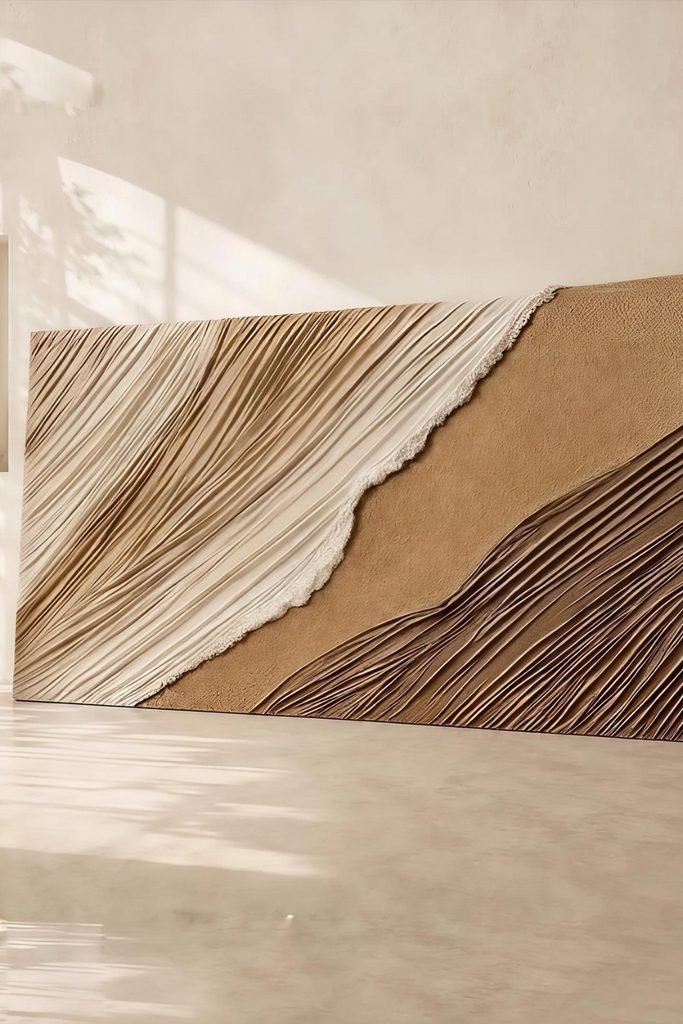
Layered Ridges
Instead of covering the whole canvas evenly, divide it into sweeping sections and pull narrow ridges diagonally through each textured area.
Keep one section comparatively smooth so the detailed grooves have breathing room, then introduce cream and brown tones after everything dries.
Side lighting works especially well here because every raised line casts a small shadow, making a large neutral piece feel deeper.
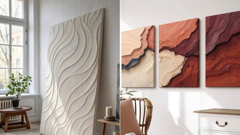
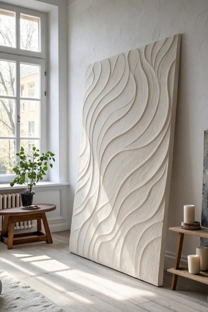
Flowing Relief
For softer movement, sketch loose vertical curves first, then build raised edges along those guides rather than creating perfectly repeated waves.
Smooth the surrounding texture gently so those curved ridges remain dominant, especially when working with a tall canvas or rigid panel.
Keeping everything one warm white lets natural window light reveal the pattern without relying on extra colors for visual interest.
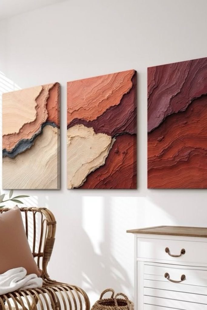
Earthy Layers
Try building several irregular bands with a palette knife when you want texture that feels closer to layered stone than brushwork.
Vary each band’s thickness slightly, then paint neighboring sections in terracotta, burgundy, cream, and charcoal once the surface dries completely.
Splitting one continuous composition across three canvases can fill a wide wall while keeping each individual panel easier to handle.
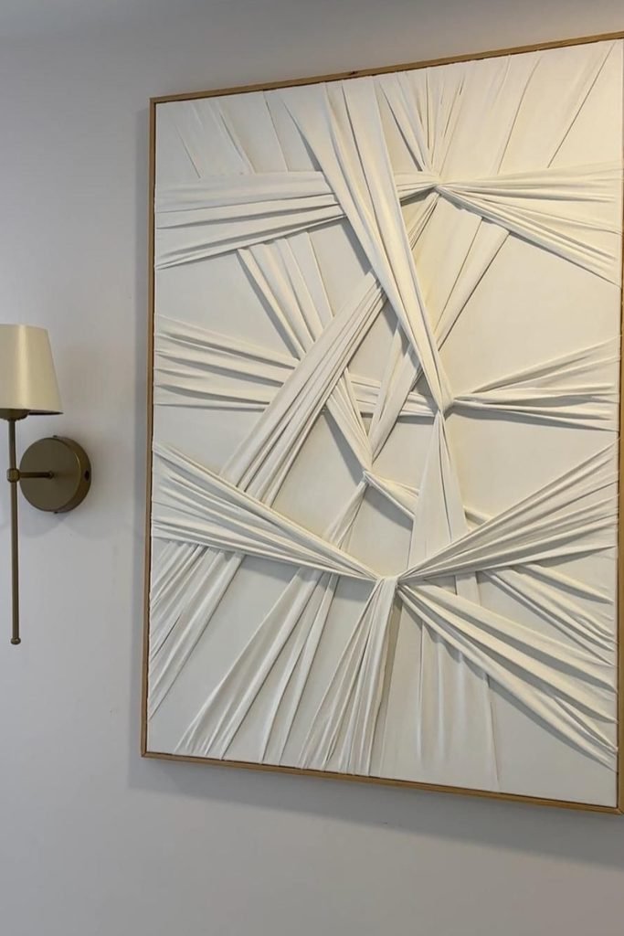
Gathered Fabric
Texture doesn’t always need plaster, so stretched fabric can bring dramatic dimension without covering an entire canvas in heavy compound.
Pinch and gather fabric toward different anchor points, securing each section firmly behind the backing before adjusting folds for balanced tension.
A single light color keeps the overlapping folds from becoming busy, while nearby wall lighting brings out their strongest shadows.
Raised Chevrons
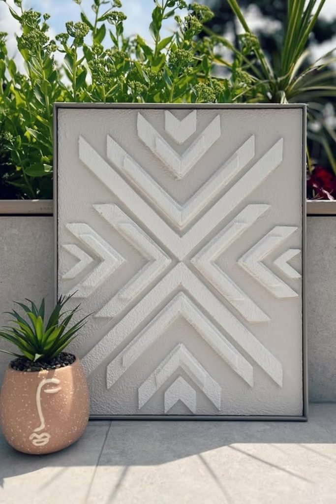
Clean geometry becomes much easier when you sketch the center points first, then build matching chevrons outward with narrow raised strips.
Keep the background slightly textured rather than perfectly smooth, giving those crisp white shapes enough contrast without introducing another distracting color.
For a smaller canvas like this, consistent spacing matters more than heavy relief, so measure each repeated angle before adding texture.
Curved Contrast
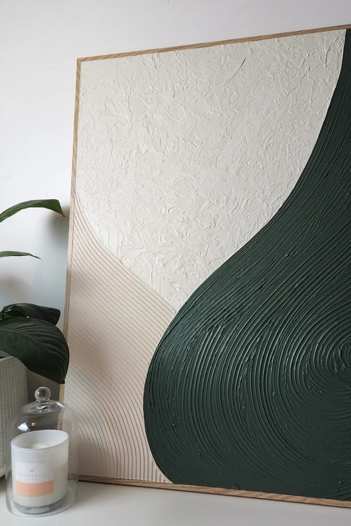
Playing with two texture styles can give a simple composition far more depth than covering every section with identical grooves.
Sweep a comb through the darker compound in broad curves, then leave the pale center rough and lightly score the smaller section.
Deep green beside warm neutrals makes this especially useful when you want textured artwork to connect naturally with plants and wooden furniture.
Landscape Layers
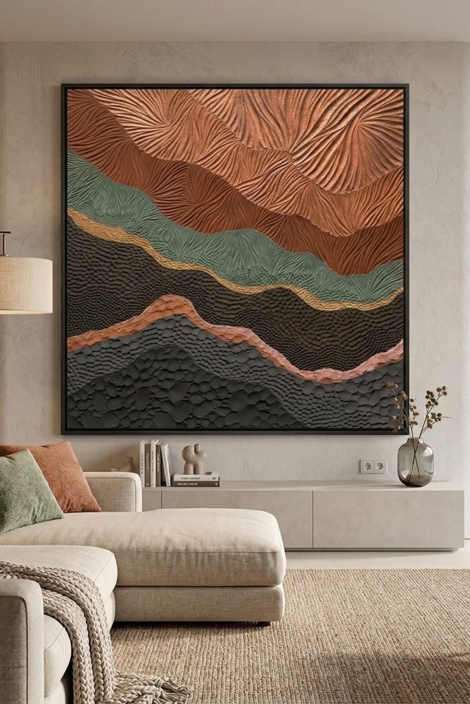
For a statement piece, treat each flowing band as its own landscape and change both the texture technique and color between sections.
Fan-shaped grooves work beautifully across upper areas, while stippled and overlapping palette-knife marks can make lower sections feel heavier and grounded.
Plan the complete pattern before applying compound, because multiple raised textures need clear boundaries to stay intentional rather than visually crowded.
Sculpted Flower
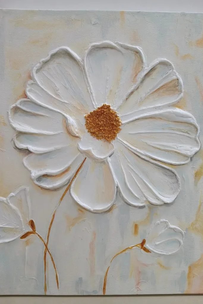
Floral texture feels more dimensional when you build each petal individually instead of simply drawing its outline over a flat background.
Shape raises borders first, then pulls thinner compounds through each petal while keeping the golden center noticeably rougher for stronger contrast.
Soft cream and muted background washes keep the flower dominant, making this approachable when you want decorative texture without complicated geometric measuring.
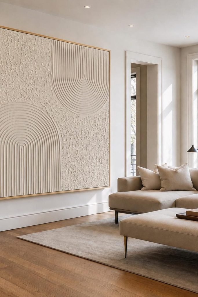
Oversized Arches
Going large with repeated arches works best when you mark each curve beforehand, keeping the spacing consistent as the pattern expands.
Use a narrow comb or notched tool through a workable compound, then contrast those controlled grooves against loosely stippled background sections.
Keeping everything creamy white prevents an oversized piece from overwhelming the room, while a slim wood frame gives the edges definition.
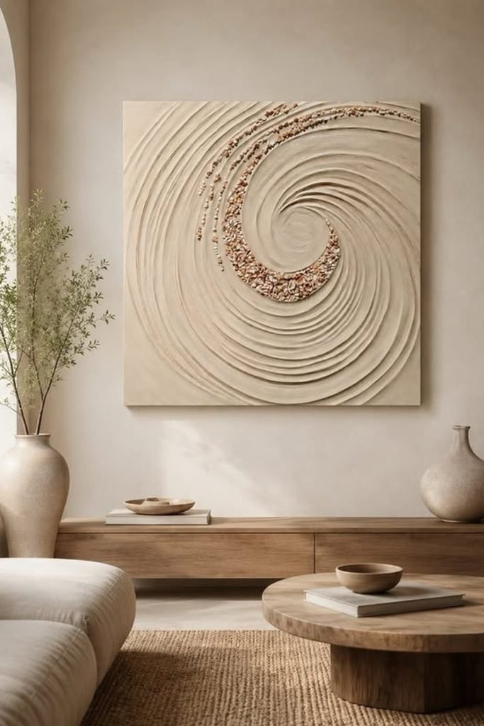
Spiral Texture
A spiral gives you plenty of movement without complicated measuring, especially when you begin near the center and gradually widen outward.
Drag a rounded tool through the wet compound in one continuous direction, keeping neighboring grooves separated instead of repeatedly correcting each pass.
Press small stones or coarse decorative pieces into selected grooves before drying to introduce contrast without adding several competing paint colors.
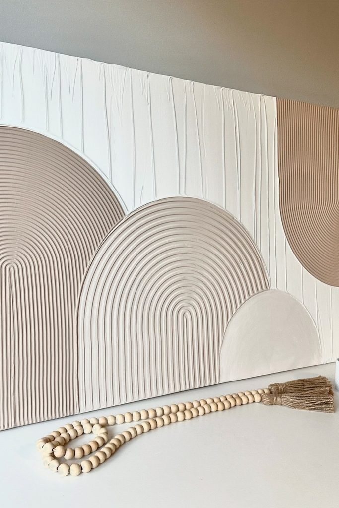
Rounded Patterns
If straight geometric lines feel too rigid, overlapping arches can create structure while still keeping a softer, more relaxed handmade character.
Map the largest curves first, then comb evenly spaced grooves inside selected shapes while leaving others smooth or vertically scraped.
Using slightly different neutral shades separates overlapping forms gently, making this approach especially useful for wide canvases above consoles or dressers.
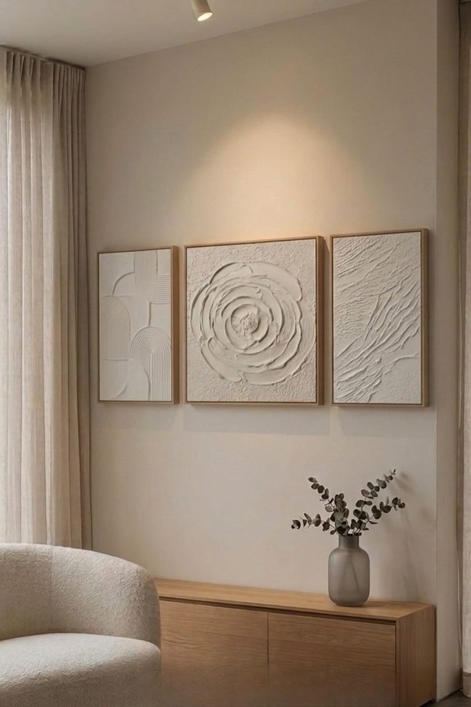
Mixed Triptych
One large texture technique isn’t your only option, especially when three smaller panels can let you experiment without risking one oversized project.
Give each panel its own treatment, such as combed arches, sculpted petals, and rough palette-knife strokes, while repeating one neutral finish.
Matching wooden frames tie those different techniques together, so the finished grouping feels coordinated instead of looking like unrelated practice pieces.
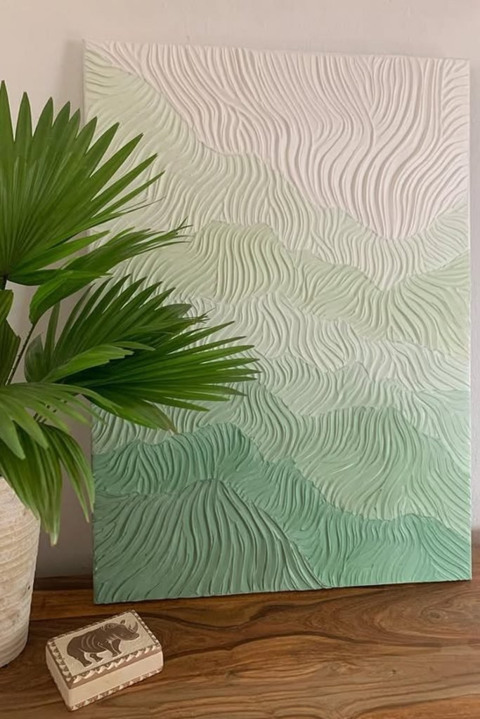
Wavy Terrain
Let color follow the texture instead of sitting on top randomly, using soft green layers to separate each flowing section naturally.
Pull narrow grooves in changing directions with a comb, allowing gentle bends and irregular spacing to keep the surface feeling handmade.
Moving from deeper green below to pale cream above creates an easy gradient that works beautifully beside leafy indoor plants.
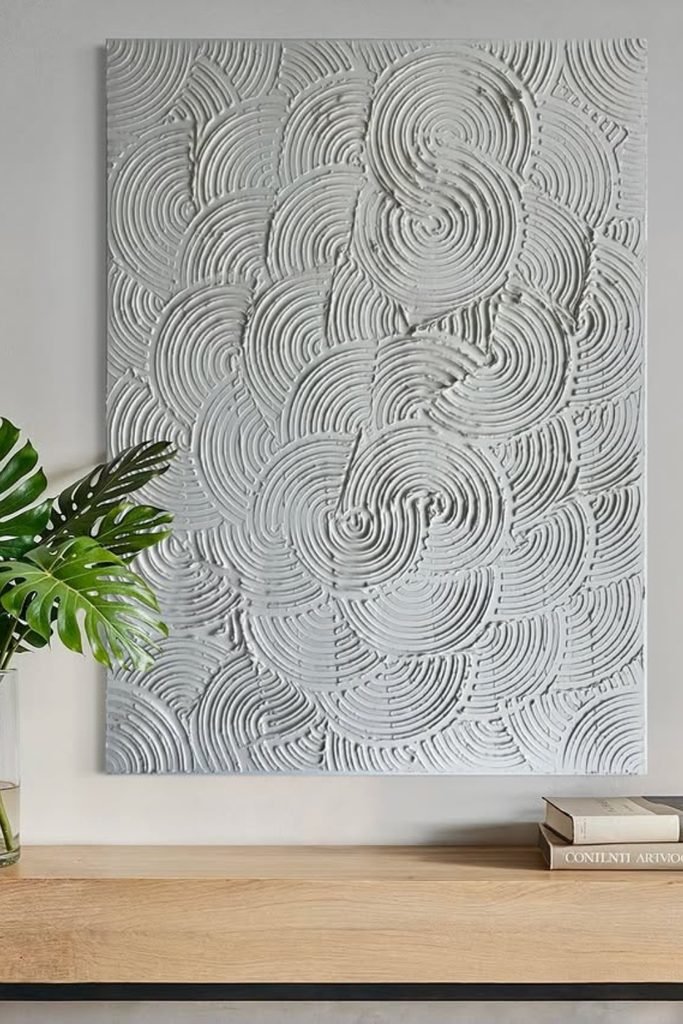
Overlapping Circles
Repetition can become the whole design when you press curved grooves into wet compounds and deliberately overlap their edges across the canvas.
Start with larger circular impressions, then fill awkward gaps with partial curves instead of forcing every pattern to remain completely visible.
A single white finish keeps this busy texture controlled, making shadows between the grooves responsible for most of the visual depth.
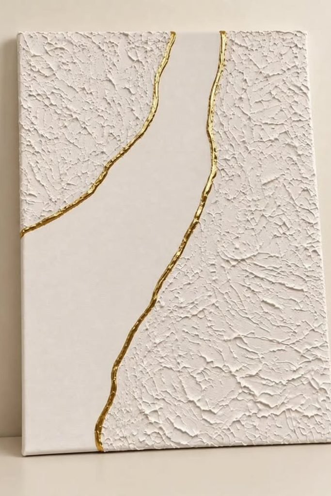
Golden Divide
Leaving part of your canvas smooth gives rough texture more impact, especially when an irregular metallic line separates the contrasting surfaces.
Apply compound only to selected sections with a palette knife, keeping the edges organic before smoothing the untouched center area clean.
Once fully dry, trace those uneven boundaries with gold paint for a polished accent that doesn’t require complicated sculpting skills.
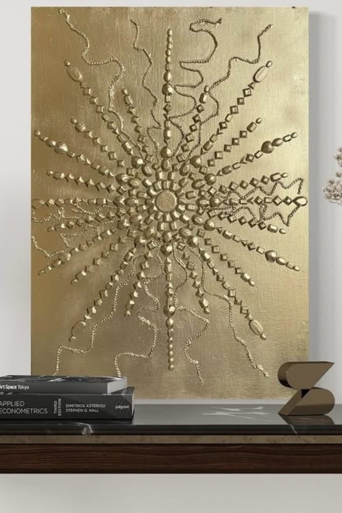
Metallic Burst
Small raised details can create dramatic texture without thickly coating the canvas, making this approach useful when you want something more decorative.
Build a central focal point, then arrange thin lines, dots, and geometric marks outward in uneven lengths to form energetic movement.
Finishing the entire surface in one metallic tone unifies those different shapes, while nearby lamp light helps every tiny relief catch attention.
Rough Color Blocks
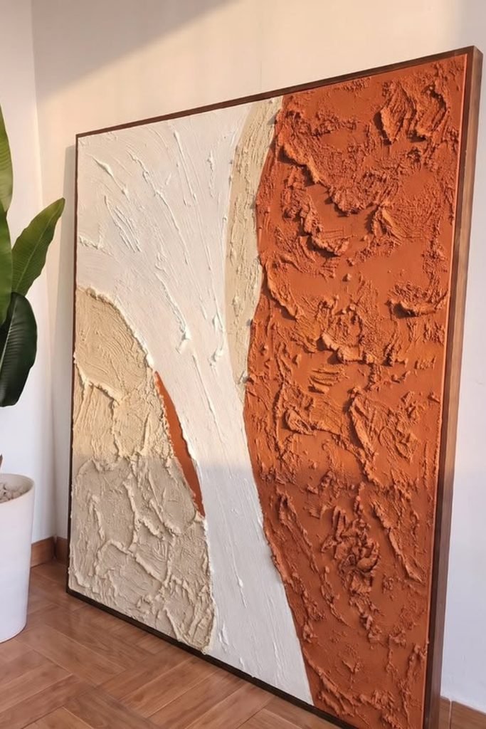
Skip perfectly blended sections when you want stronger character, and let thick palette-knife marks become part of each oversized color block.
Spread terracotta, cream, and sandy neutrals in separate curved areas, varying pressure so some ridges stay pronounced while others flatten naturally.
Because heavy texture adds weight quickly, build shallower layers across large canvases and save thicker peaks for a few intentional areas.
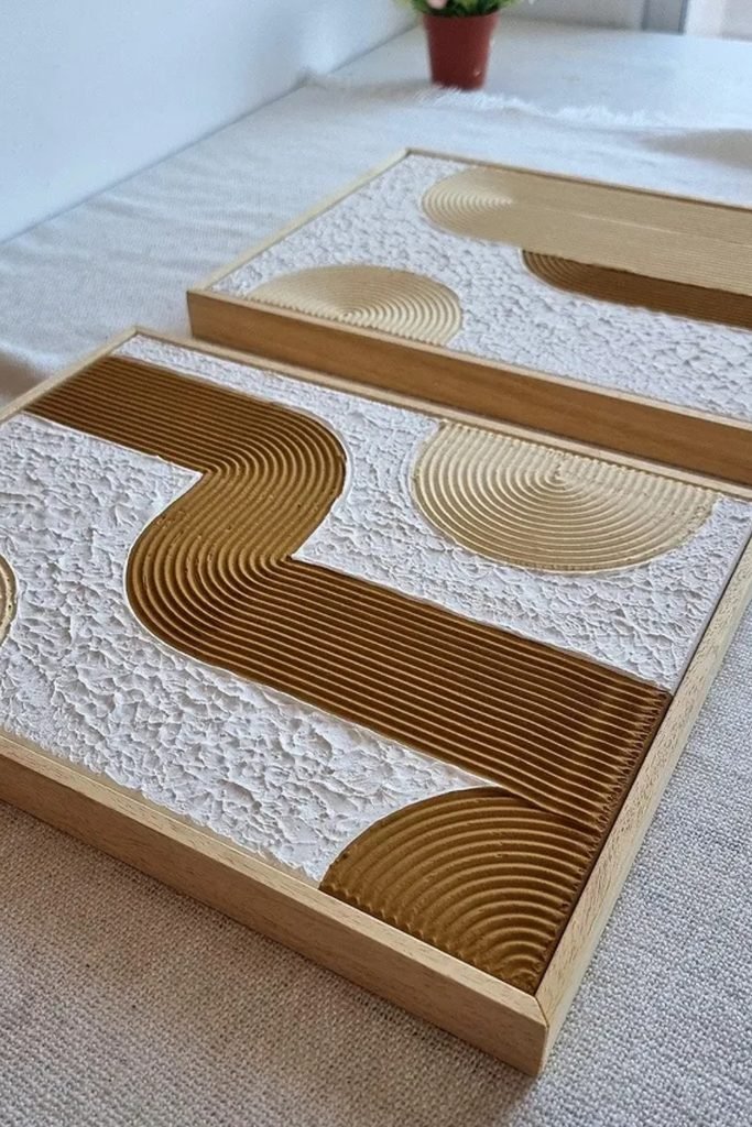
Grooved Geometry
Smaller canvases are perfect for practicing precise grooves because you can control each turn without dragging a tool across excessive wet compounds.
Outline a few rounded geometric shapes, then pull evenly spaced lines through them while keeping the surrounding white texture deliberately rough.
Pairing caramel and cream sections adds definition without making the pattern busy, and simple wooden frames give both finishes a cleaner boundary.
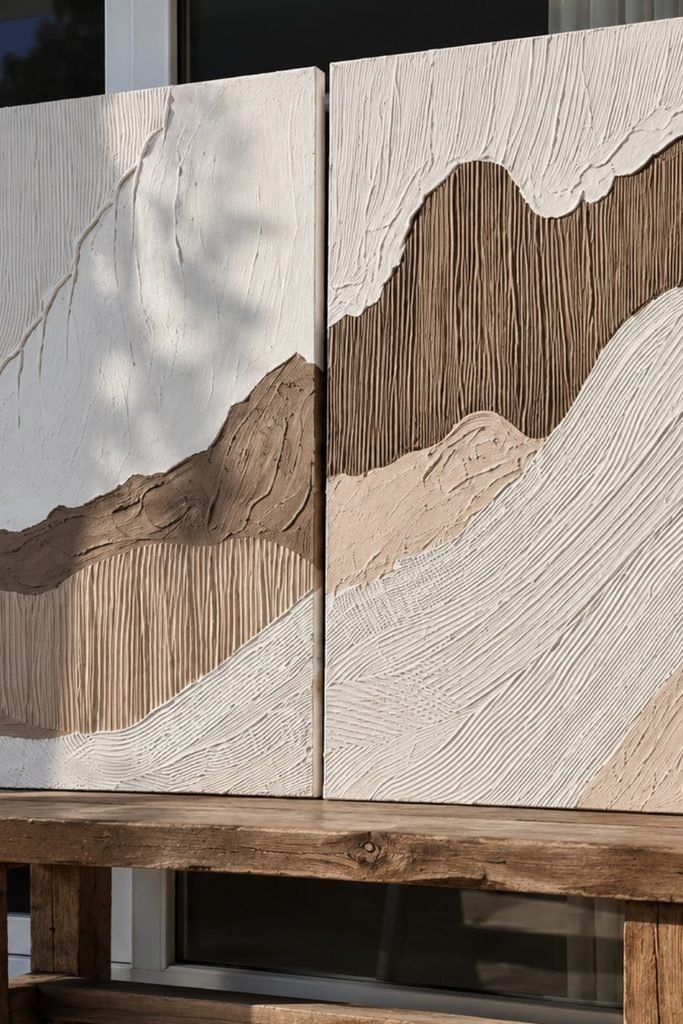
Textured Diptych
When one canvas feels limiting, carry the same flowing composition across two panels and let the center gap become intentional negative space.
Alternate fine combed lines with rough palette-knife sections, changing direction between neighboring shapes so every neutral layer remains easy to distinguish.
Keep both panels aligned while planning the pattern, otherwise the curves can lose their continuity once the finished pieces hang together.
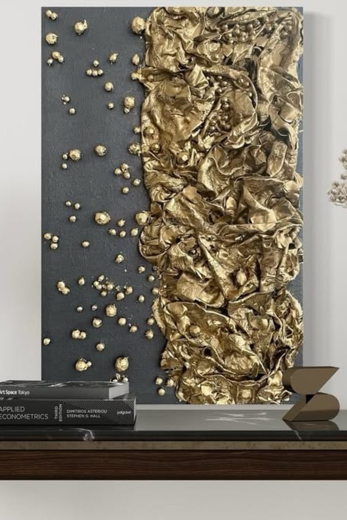
Crumpled Metallics
For dramatic relief without carving dozens of grooves, build irregular crumpled forms on one side and keep the opposite background comparatively flat.
Once those raised folds are secure, metallic gold can emphasize every crease while scattered smaller pieces gradually soften the transition outward.
A charcoal background gives the metallic texture enough contrast, making this technique especially effective for a statement piece above a console.
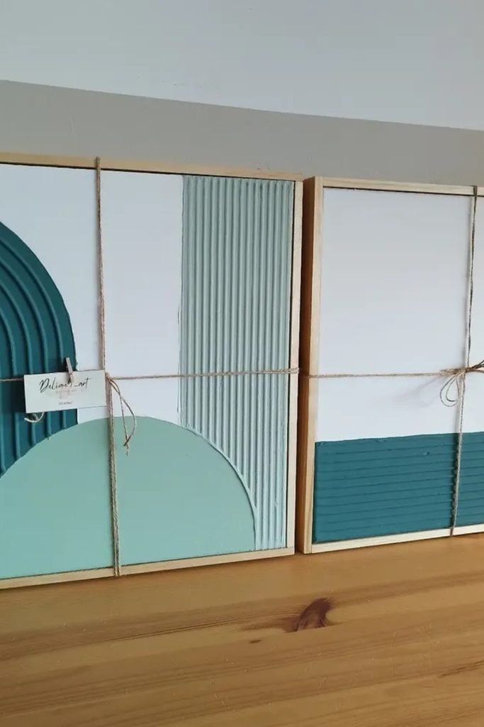
Teal Geometry
Bold color can still feel controlled when you reserve it for selected shapes and let crisp white areas break up the composition.
Carve parallel grooves through teal and sage sections, switching between curved and straight passes so each block develops its own rhythm.
Try this across two matching canvases when filling a wider wall, repeating the same colors without making both patterns completely identical.
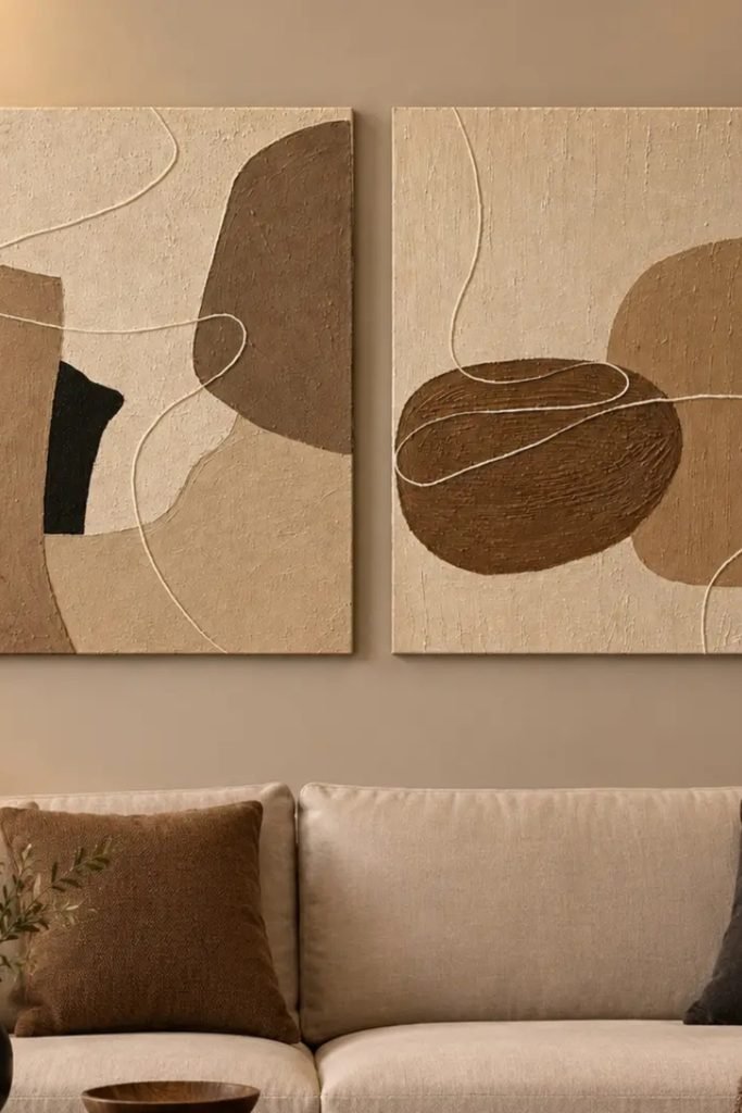
Abstract Neutrals
Loose shapes are forgiving for beginners because uneven curves become part of the composition rather than mistakes you need to keep correcting.
Block in cream, taupe, brown, and black areas first, then add thin raised lines that wander naturally across both canvases.
Continue a few shapes or lines visually between the panels so the pair feels connected when displayed together above a sofa.
FAQs
What Can I Use Instead of Joint Compound for Textured Wall Art?
Modeling paste, texture paste, lightweight spackle, and suitable plaster products can all create raised texture.
For smaller pieces, modeling paste gives you more control, while joint compound remains useful when covering a larger surface affordably.
How Do I Keep Textured Wall Art From Cracking?
Start with a stable surface and avoid piling thick compound onto the canvas in one heavy application.
Let every section dry completely before painting or sealing, and avoid rushing the process with strong heat.

Hi, my name is Ali Mehmood! I’m a passionate writer and DIY enthusiast who loves turning creative ideas into practical, hands-on projects.
I created this website to share inspiring, budget-friendly ideas that you can do yourself – whether it’s organizing your home, crafting something unique, or creating fun projects for kids and pets.
I believe DIY isn’t just a hobby – it’s a smart way to save money, reduce waste, and enjoy the satisfaction of making things with your own hands.
I’m excited to have you as part of this growing community, and I’ll continue bringing you helpful, realistic, and fun DIY ideas you can actually use.